Mudenda Capital
An investment firm site whose logo splits open as you scroll
Site for Mudenda Capital, an investment firm and family office. The home page opens on the company logo, which splits in two as you scroll to reveal the office and the firm's positioning and its partners.

- Built for
- Mudenda Capital
- My role
- Design and build of the site.
- When
- 2025 to 2026
- Next.js
- TypeScript
- GSAP
- ScrollTrigger
- Tailwind CSS
The longer version
What it is
A five-page site (home, services, team, contact and an about section) for a family office. The brief was to feel solid and private rather than salesy, so the site makes one gesture, the opening logo, and keeps the rest calm.
Screens and demos
What it looks like in use, not just what it was designed to do.
Home page 
After the logo opens 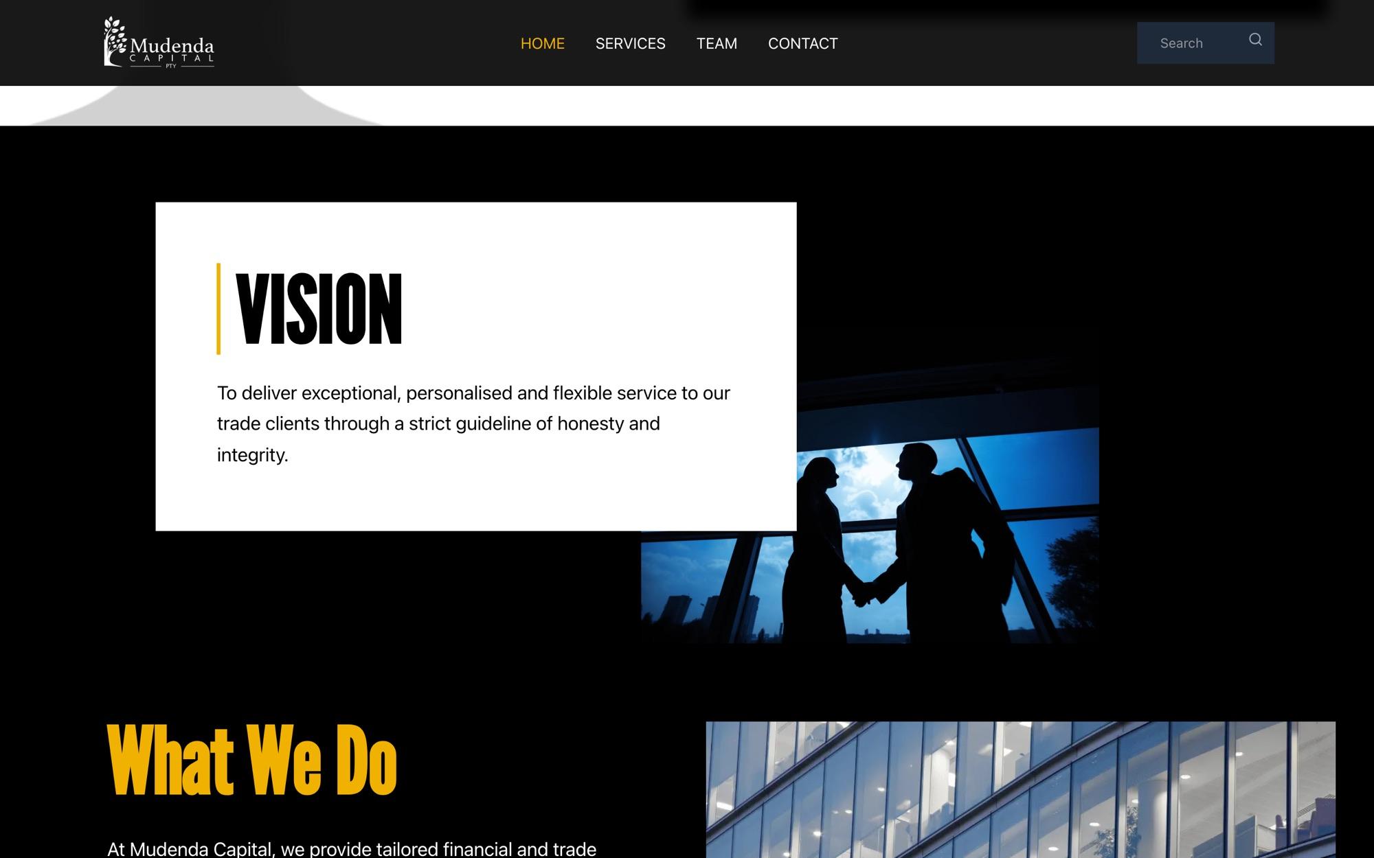
Vision and services 
On a phone, a separate static hero
What made it hard
The problems worth reading about. Everything else in this system was ordinary work.
- 01
The logo is built in two halves on a pinned, scrubbed GSAP timeline: scrolling slides them apart to the edges of the screen, uncovering the building behind and the Family Office headline, like opening doors.
- 02
Phones get a separate, static version of the hero rather than a squeezed copy of the desktop animation.
- 03
The animation is scrubbed rather than played: halfway down the scroll the doors are halfway open, and scrolling back closes them.